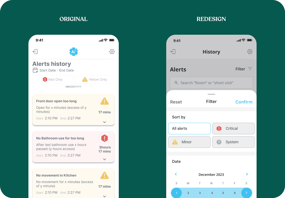
Optimizing the alerts history on Aeyesafe mobile
I designed key features to a mobile B2B SaaS product with the startup founder and led and managed a team of designers to build out multiple key features. Due to NDA, the designs I have provided do not reflect the final product.
Timeline
3 months
Role
Lead designer
Team
4 Designers, 8 engineers, 1 PM
Context
I led the redesign for alert cards and alert history on the Aeyesafe beta 2.0 app.
Aeyesafe is an AI health monitoring service that combines AI with product, allowing caregivers to monitor seniors from their web and mobile application. They use multiple AI sensors to provide real time alerts, reports and behavior monitoring.
Results
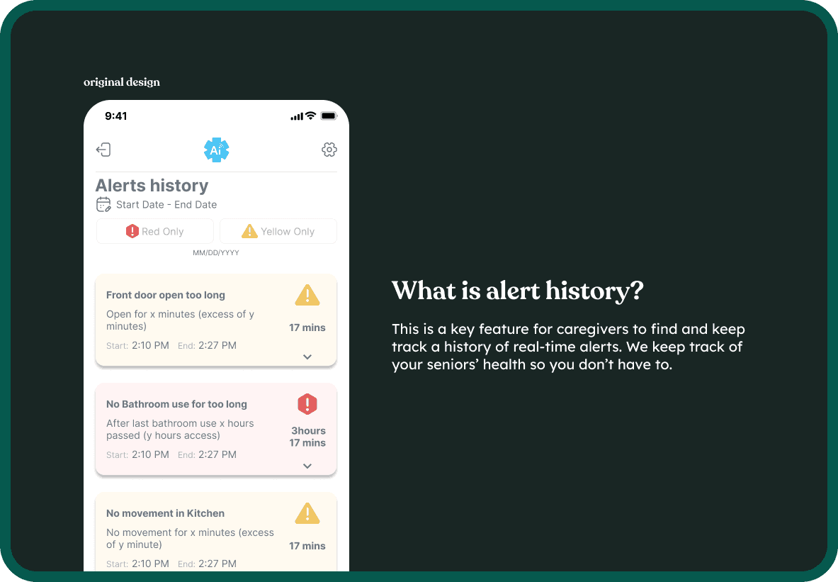
Current problem
To put the problem in perspective
how might we create a helpful way to connect users with understanding alerts?
📍 Goals
Research and iterate designs in order to improve the alert cards and alert history, so that caregivers can easily reference reports and cite specific information in order to reduce stress and frustration when providing care.
By enhancing alert discoverability, modernizing the design, and making it easier to understanding an alert, we will have improved the alert history experience.
Guiding our ideations
While beginning my explorative ideation phase, I kept these questions in mind to ensure that my designs aligned well the the project's goals. I assigned these questions to themes that I used as my design philosophy.
📃 Discoverability
How do I look for different alerts? How robust does filtering need to be?
🧠 Reducing overload
How can I skim information? What is a need-to-know?
🎨 Update look & feel
How can I modernize the design and give it a natural feel?
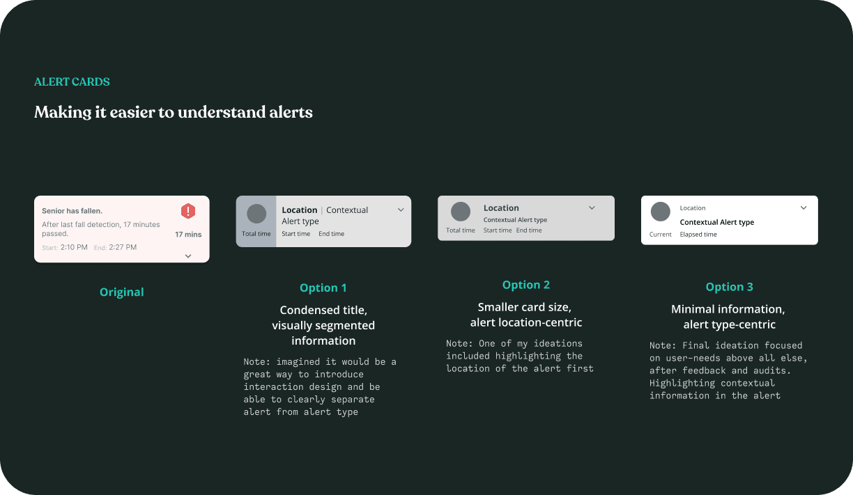
Ideating for Alert Cards
First, I started off by designing different variations of the alert card itself. An unopened card should contain a brief overlook of the alert details; clicking into the card will reveal more specific information about a real-time incident.

Original
R-side alert, text-heavy

Option 1
L-side alert, condensed title

Option 2
L-side alert, location-centric

Option 3
Left-side alert, alert-centric
To determine which options aligned best with our design philosophy and project goals, each option was evaluated against a set of metrics.
🔴 Chunky. One alert takes up the most vertical space, leaving space for only 3 alerts per scroll
🔴 Redundant & casual language. Does not condense information well, making it unclear to read.
🔴 Doesn't meet WCAG requirements. No text hierarchy. So many shades of light gray…
🟡 The division of columns creates an illusion of bulkiness when stacked with other alerts.
🟡 Redundant information is eliminated but lack of information hierarchy leaves much to be desired.
🟡 Color divider provides a visual representation of information but does not contrast well against app background and clutters the design.
🟢 Less bulky while able to convey multiple pieces of information.
🟢 Established key points to highlight. Location tag being focused makes it less obvious what the alert is about.
🟡 Doesn't meet WCAG requirements. A screen of colored alerts create clutter and confusion.
🟢 Less bulky while able to convey multiple pieces of information
🟢 Can easily be skimmed due to implementation of subheadings.
🟢 Adding color to text hierarchy further boosts readability and provides contrast. White fill color reduces overload.
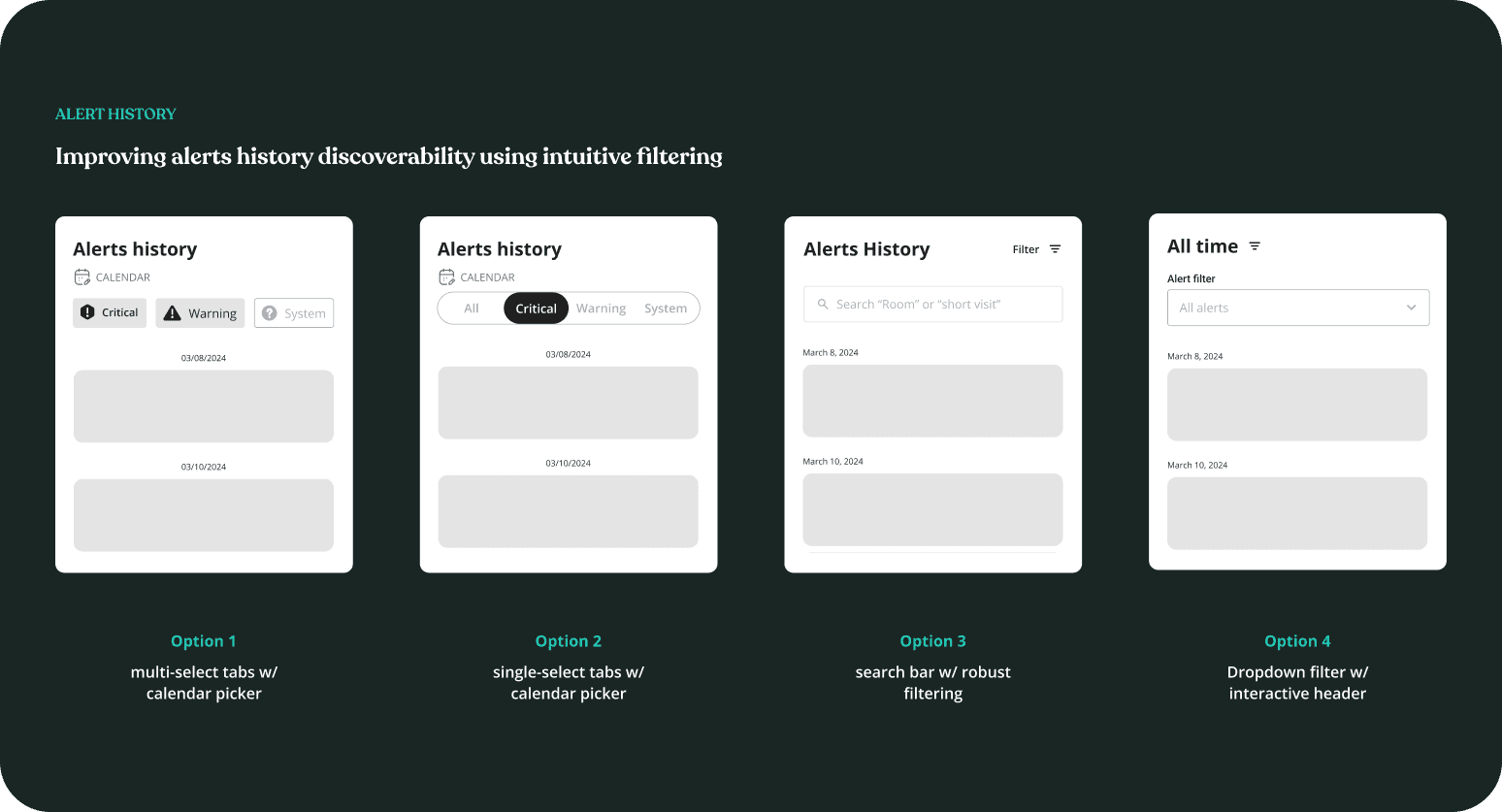
Ideating for Alert History
Next, I worked on designing different ways to convey the alert history filter. I wanted to boost discoverability and help guide users to tools they need to locate alerts. I ideated on different ways a user could sort information, in order to quickly refer to an alert type, focusing more on navigation/layout rather than information.
We ended up eliminating Option 1 based on feedback and notes from my comp audit. We found that sorting by multiple alert-tags at once wasn't necessary and induced clutter.
⬇️ Prototyping the remaining options
Option 2
Colored tabs, no time selection
Option 3
Search bar, time and alert type filter
Option 4
Dropdown, natural time selector
To determine which options aligned best with our design philosophy and project goals, each option was evaluated against a set of metrics.
Alert cards
AWARENESS
NATURAL
DISCOVERABILITY
OPTION 2
🟡 Fits well with the brand and encourages engagement. However this design is not scalable
🟡 Single selector tab doesn't provide enough information at a glance.
🟡 Leaves no room for a time selector.
OPTION 3
(recommended ✅)
🟢While filtering is less prominent, search bar helps with looking for specific instances or narrowing the search more.
🟡 While better at handling more information, this overcrowds the screen vertically. Overwhelming when needing to make quick gestures.
🟢 Hiding 2 key filter options could potentially hinder input guidance if this suggestion is not prominent enough.
OPTION 4
🟢 Header text that changes upon user input clarifies input selection. Dropdown is scalable.
🟡 Gracefully allows users to filter 2 factors. But what if we need more filtering factors in the future?
🟢 Provides access to necessary information with one click without ambiguity.
Testing & validation
While I used heuristics to assist in decision-making, I still needed to prove my hypotheses.
Due to time and resource limitations, we had restrictions to user testing but were able to test our designs with 2 participants. Despite there only being 2 participants, I really valued the insights they provided.
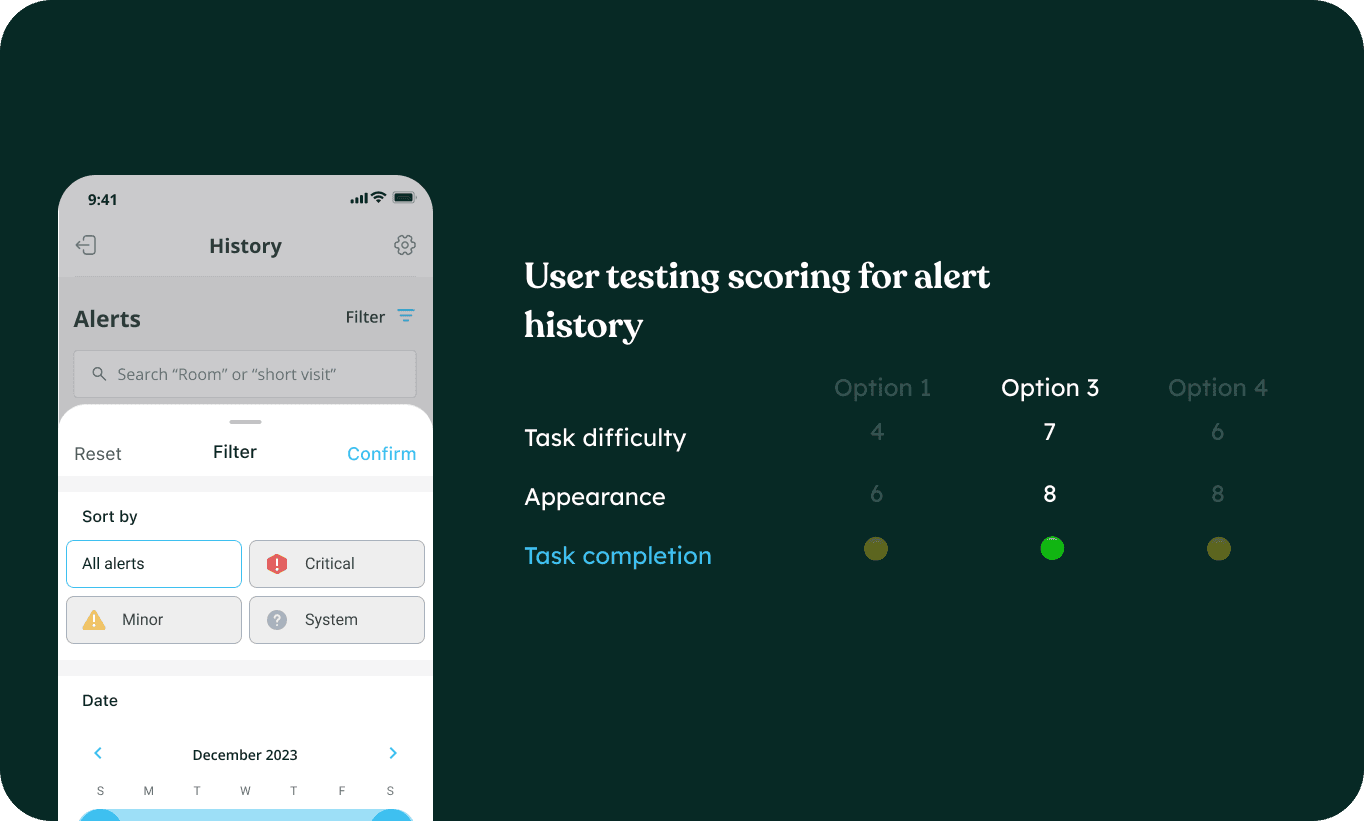
I conducted a moderated study to see if the alerts history improved discoverability and tracking. I asked participants to perform a series of tasks, which they then scored from difficult (0) to easy (10).
I also measured how long it took to complete tasks, noted any difficulties or confusion and also asked participants to score the overall appearance.
Post study questions
Preparation
Prototype of a user flow with various designs to test
Questions and script drafted with the design team
Sample Questions
Did you find the filter functionality helpful in location the specific patient report?
Where on the alert card is your eye drawn to first?
What are the details of the events that happened in the Bathroom 1 month ago?
What did you think this interaction might mean? What did you expect would happen if you tapped here?
User testing results
I presented the options for the alerts history to our participants who said that they more inclined to pick option 3 (pictured above).
"I liked option 3 the best because everything I need is just consolidated onto 1 screen and it felt the easiest to understand and use."
"Option 4 looked nice but I just didn't get the time selector..."
Result insights
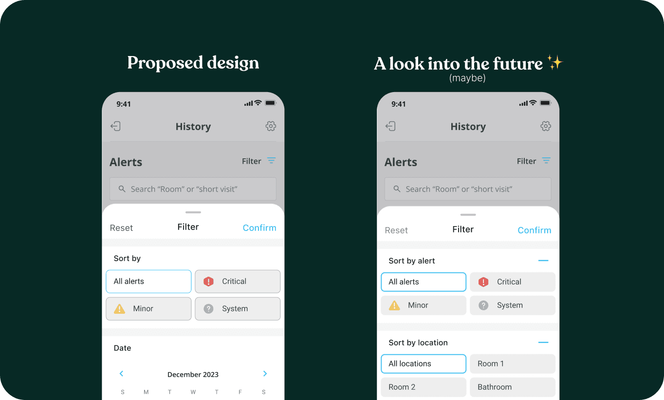
After reviewing the results I proposed option 3 which highlighted a clear alert type filter, and an intuitive time selector.
Having a clean design with segmented information helped users with discoverability. They perceived this design more positively because the lessened screen clutter guided their decision-making process.
This made performing tasks more efficient, allowing caregivers to get the most out of their alert history.
📌 Reflections
During these 6 months, I got to lead on various designs. I got to learn a lot about Android and iOS mobile designs and learning to design interactions. I learned to design for simplicity in order to help alleviate user stress and I really valued the importance of reiterating designs. This project showed that even minute changes with each iteration really makes an impact.
I also learned that even small changes make big differences!
Take a look at how my proposed design can grow!
At a startup, it's important to make sure your design can grow and blossom even though I'm not there anymore. I wanted to pick the best design for our users to fit their needs and potentially meet needs they don't know about yet.
Giving them the space to recognize that they might need more filtering critical alert options is important when it comes to health monitoring.

