Designing to connect people with luxury living spaces, easily.
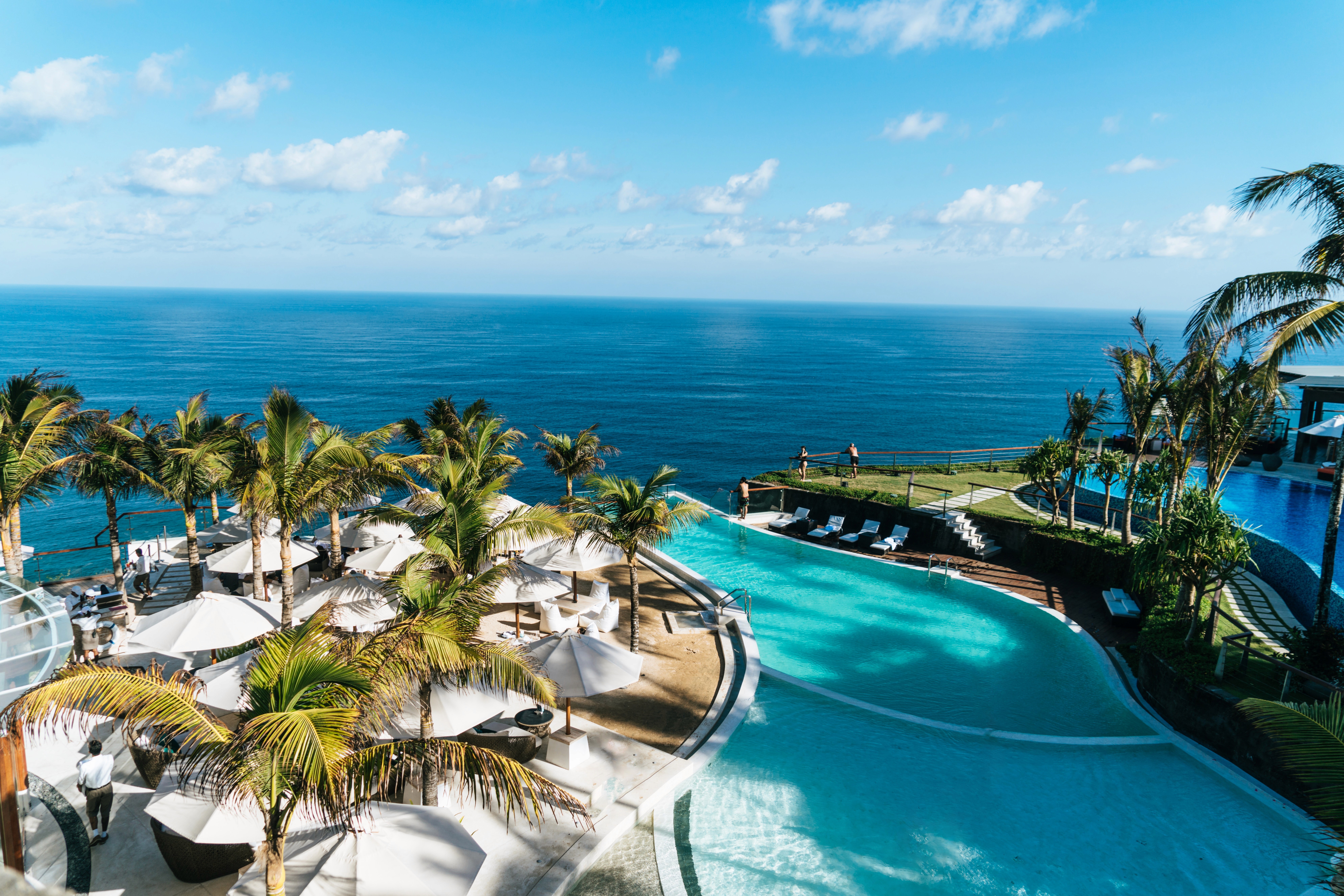
Our client wanted me to tackle a project for their exclusive island located which offers luxury real estate properties and vacation excursions.
I had the opportunity to work for this client for 2 months. I was incredibly grateful that I was able to work on this project! Please contact me for more details at hi.mindymaung@gmail.com
Timeline
Role
Team
Deliverables
Market research, user research, IA, wireframes
Background
Founded by their roots in making memorable getaways and curating a family-friendly environment, the client began their business offering special luxury villa holidays in the British Virgin Islands.
While their early growth is attributed to word-of-mouth and many phone calls, their clientele was expanding and they were beginning to receive requests to book trips and find their dream vacations online. However the Client A's bare website was making it difficult for villa-goers to find and book trips.
Users were struggling to navigate their website and differentiate buying from renting their dream villas.
Client A is fueled by their productive staffing and handpicked specialists who match clients that fit their exact needs and vacation vision. The issue was that I discovered that prospective users were put off by the lack of information they could find online, despite Client A having a website available. People were struggling finding information through sources other than TripAdvisor and the experience lacked customer/support communication.
Solution
As intimidating as it seemed, I started over from scratch. I pitched an idea to create a centralized website that utilized subdomains in the top navigation to support users rather than confuse them in order to alleviate decision-making.
My contribution
I started this project by being the first advocate for UX in the studio. I prioritized following a user-centered design process to the stakeholders and took the lead on conducting research on our users.
I designed and remapped different options of the information architecture and synthesized my usability testing feedback for stakeholders to showcase performance metrics for the IA options.
Communicating with stakeholders
With complicated problems comes some necessary kickoff questions:
Goals: What should we try to achieve in 2 months? What are mine and everyone else's goals for this project?
Success: How do we measure our success through quantitative and qualitative measures?
Risks: What are some of the factors that might prevent us from achieving our goals? What do we need to think more about before diving into the project?
Assumptions: What does the team assume to be true? What needs to be validated through research?
It was important to communicate a project timeline and keep them in the loop of my findings. For example some ideas the stakeholder had weren't actually proven to be helpful for users interacting with the design. I shared my feedback using supported testing and research!
I found that there were two primary groups of customers.
👤Type 1
Elderly parents looking to retire and find their dream home at the island.
They want a permanent spot, a real place to call home.
They want trustworthy people and might even want to bring in custom builders.
They want a quiet life of luxury.
👤Type 2
Families looking to come here to vacation.
They want respectable villas and need certain amenities.
They need family oriented activities. Parents want something for everyone to do, meaning everyone in the family is able to freely explore their interests individually.
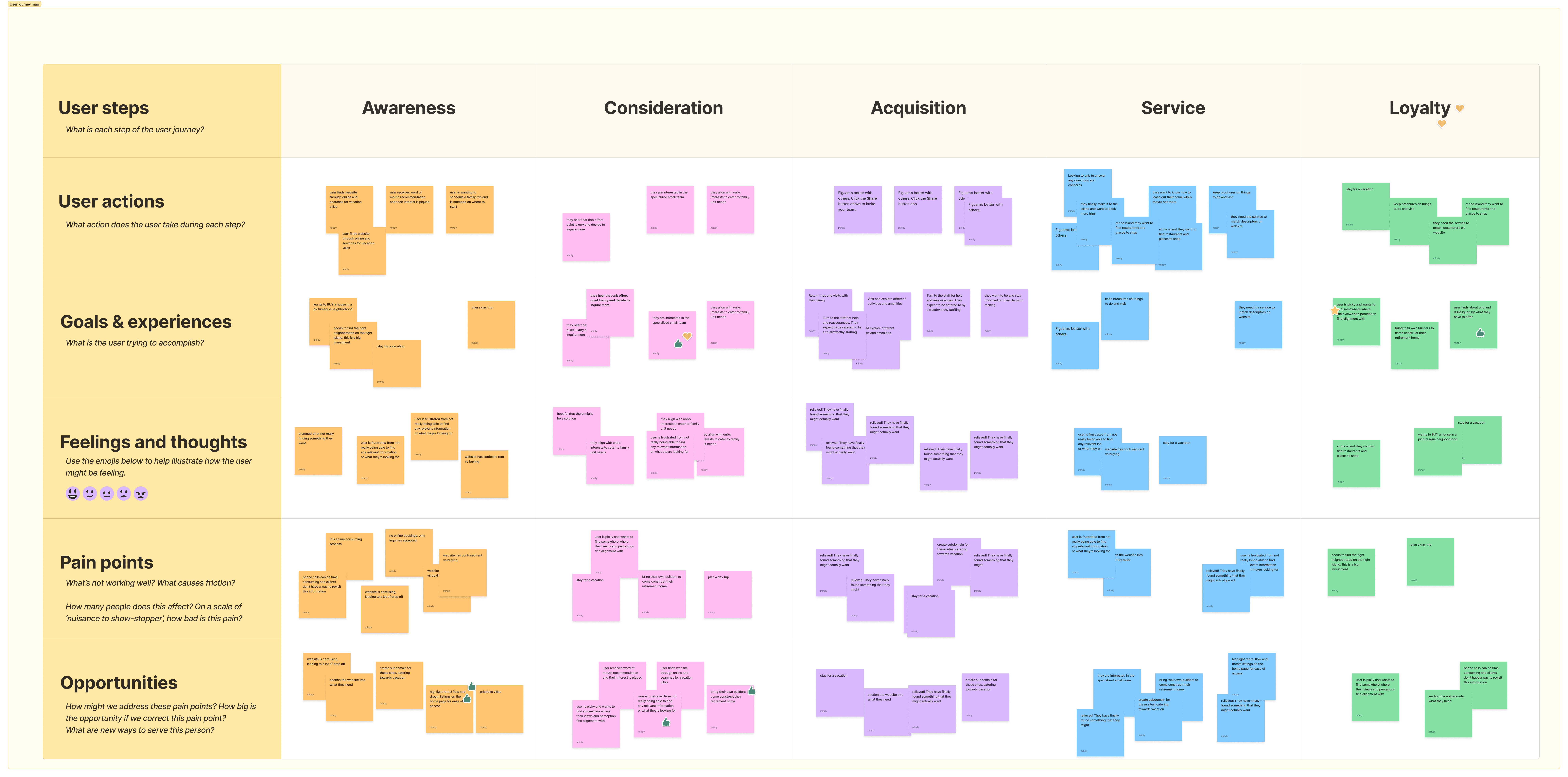
In order to start drafting ideas, I first created a user journey board activity to the design team.
I was the only UX designer and I wanted the rest of the design team to see the value in tackling the problem from their perspective, looking at what EXACTLY did the clientele need for our client to succeed.
Card sorting and testing the results.
The task was a challenge but after proposing and conducting an in-office card sort activity, I came up with a new IA. With usability in mind, I also aimed to create the feeling of being able to find a dream experience.
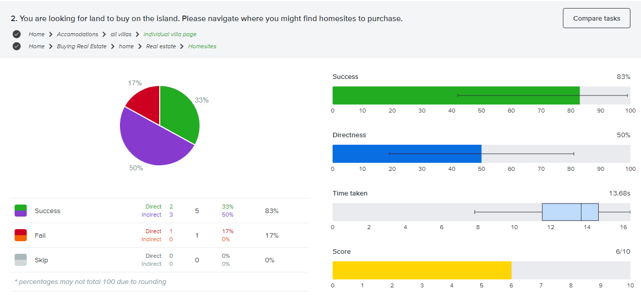
Tree testing
I gave users a series of tasks that resulted in a higher success rate.
Any failed answers or indirectness in selecting an answer, I received as feedback and worked to make the design clearer. This meant renaming links and rethinking possible flows.
Designing solutions
My primary goal was to avoid overwhelming users with information and using visual hierarchy to make the information displayed as clear as possible.
I designed 40+ screens lofi screens in a week and participated in a design crit with the rest of the team before the client meeting. With minor tweaks to the design, I chose to prioritize specific screens within the flow that were more important to our client.
Prioritizing screens within the flow.
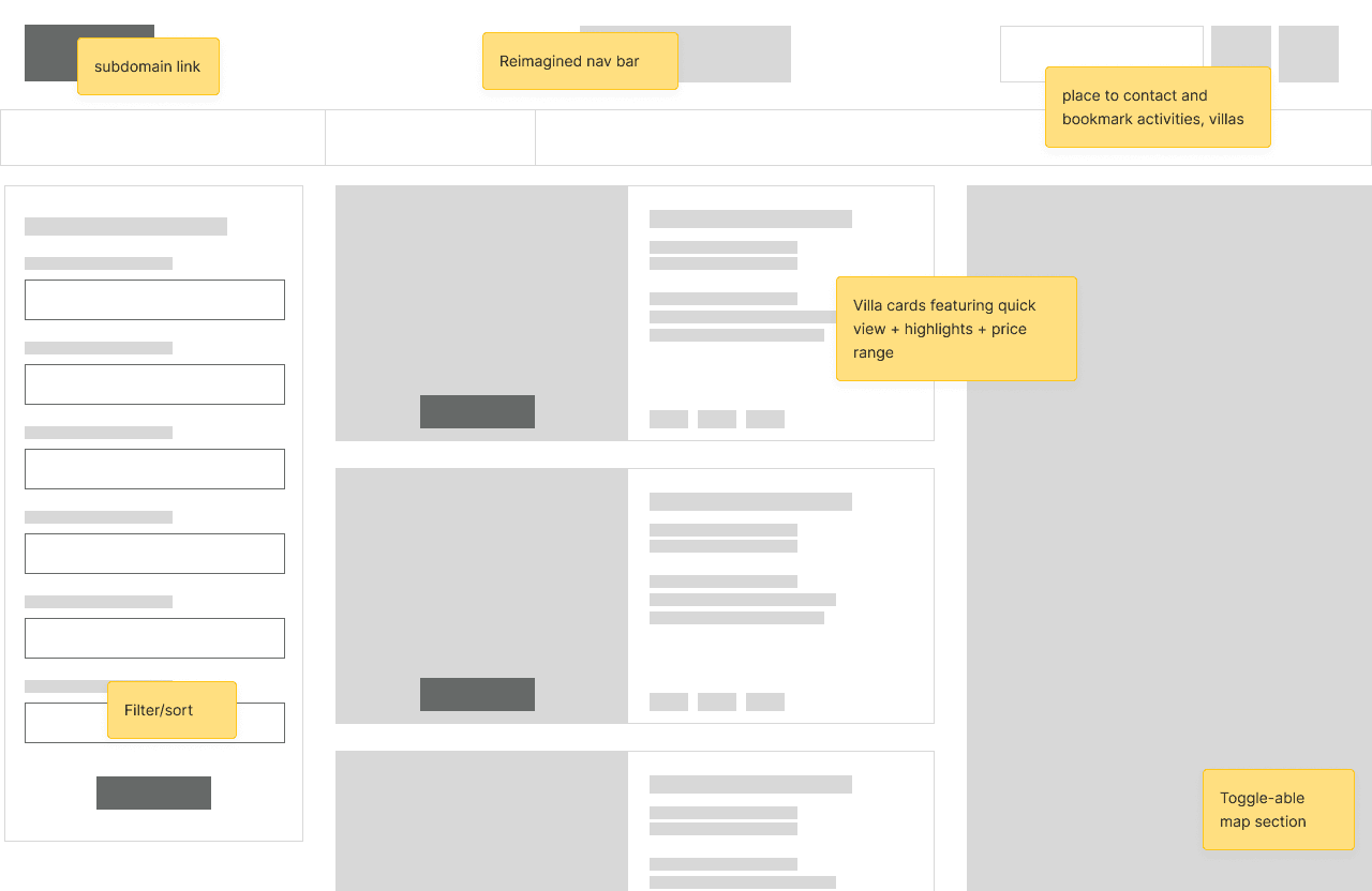
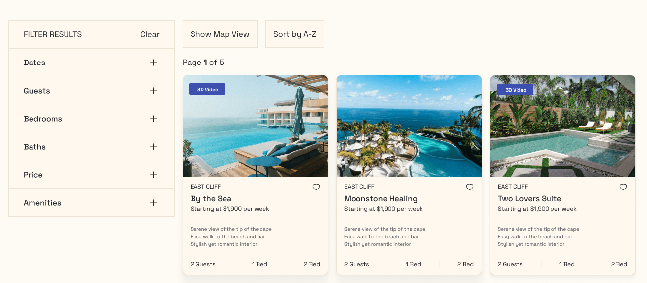
Their current website had no way to filter or search for villas. I implemented progressive disclosure with the newly designed result filters that would have its own separated real estate from the rest of the information and each filterable category could all be individual collapsed.
The property cards were also redesigned to be more legible and compact, allowing us to display more results at a time by displaying cards in a two-dimensional grid which intelligently responds to six different device profiles - ranging from small smartphones all the way up to 4K screens.
Comparing before and after
I recreated similar(ish) designs that might resemble what the hifi mockups could look like.
Client A's website had no way to filter or search for villas. I implemented progressive disclosure with the newly designed result filters that would have its own separated real estate from the rest of the information and each filterable category could all be individual collapsed.
The property cards were also redesigned to be more legible and compact, allowing us to display more results at a time by displaying cards in a two-dimensional grid which intelligently responds to six different device profiles - ranging from small smartphones all the way up to 4K screens.
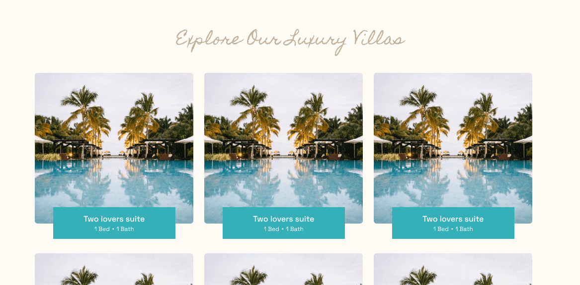
Recreation of old design. This didn't give much information and left much to be questioned. The client wanted something that felt familiar to users who used TripAdvisor and searched for villas using Google.
1) Recreation of a possible redesign (not a final design) using client feedback. I created product cards that listed tidbits of information that matched user requests and searches.
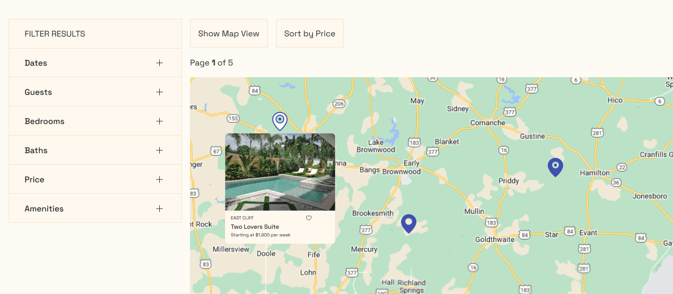
2) Recreation of a possible redesign (not a final design) using client feedback. I suggested a Map View where a user could search through the area (in real-life it would be a map of the neighborhood) to find locations instead.
What I learned
Advocating for UX
Stakeholder voices matter but so do the voices of users. My role began as a simple task of remapping the information architecture to how the stakeholder envisioned but quickly transformed into supporting a logical and successful customer journey.
I gained insight on how to better balance stakeholder needs vs. customer needs by fully allowing myself to explore ways to build in-office usability testing when getting ahold of real world customers wasn't possible!
Being a solo designer
Working as a solo UXer was a challenge but I learned how important it was to seek design mentorship through coffee chats and continue to build strong relationships inside and outside of the workplace.
Kayla, the developer, and I built a stronger sense of teamwork through our frequent communication on design projects and I felt more and more comfortable with asking for advice and answering any of her questions!
