Revamping the Aeyesafe Beta 2.0 mobile experience
I designed key features to a mobile B2B SaaS product with the startup founder and led and managed a team of designers to build out multiple key features. Due to NDA, the designs I have provided do not reflect the final product.
Timeline
6 months
Role
Designer, PM
Team
4 Designers, 8 engineers, 1 PM
Context
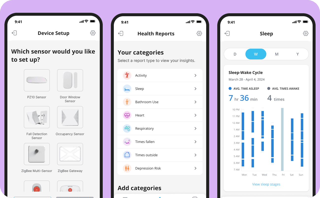
I worked closely with the founder to design the mobile version of our monitoring system to safeguard senior family members.
Aeyesafe is an AI health monitoring service that combines AI with product, allowing caregivers to monitor seniors from their web and mobile application. They use multiple AI sensors to provide real time alerts, reports and behavior monitoring.
As a ux design intern on the mobile team, I led the redesign of the entire app experience. During my 6 months, I worked alongside our product owner, engineering team and design team.
Role
We needed to be scale Aeyesafe's designs in order to prepare to ship Beta 2.0.
Caregiving is exhausting, time-consuming and stressful. Overworking caregivers can result in emergencies not being identified early or behavioral changes going un-noticed. So I led the platform-wide redesign for mobile.
Challenges
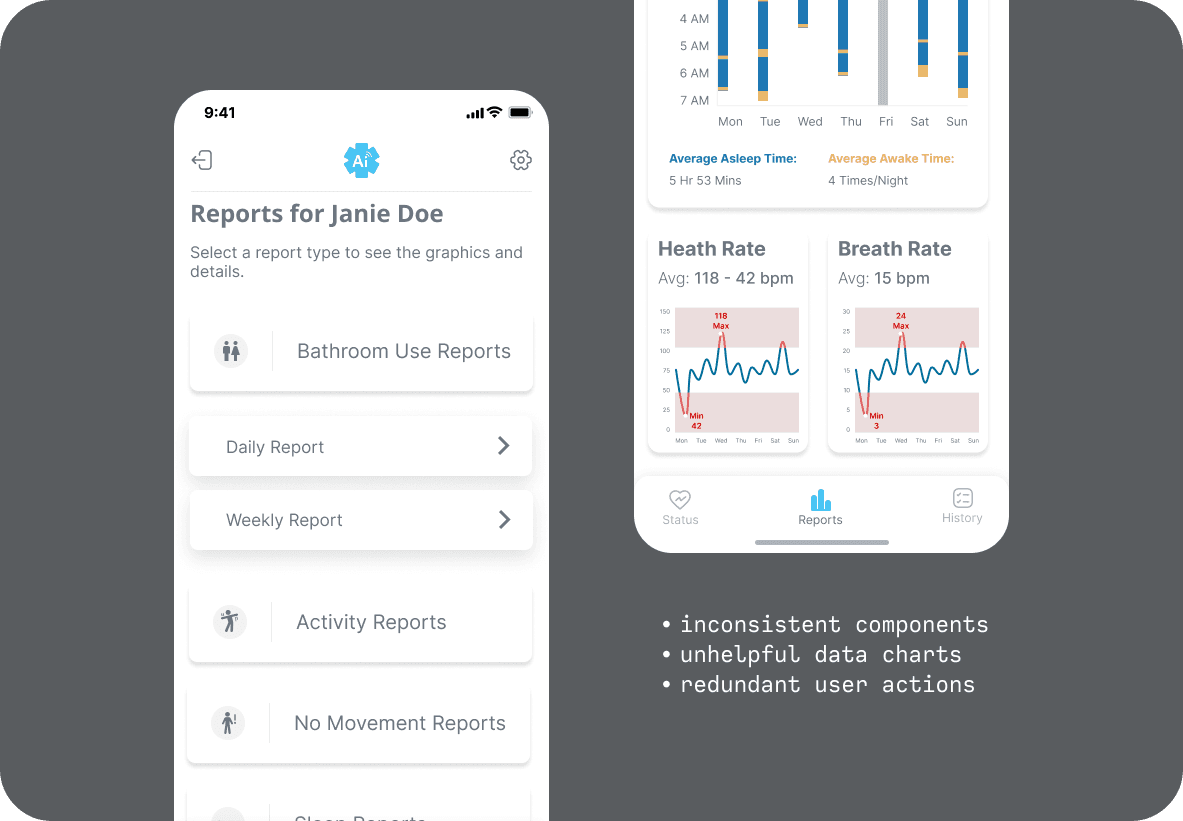
Our Beta 2.0 designs were using a mix of outdated components not from a design system which made for a lack of consistency. The design didn't have much consideration for our users, using unhelpful navigation and non-contextual information, due to our limited access to users for testing and time constraints.
Navigating testing constraints
Identifying and designing for key use cases. Due to time and resource limitations, I gathered feedback from 2 users.
Despite only conducting user testing with only 2 users, I recognized the value of their input. I created a usability testing script and prototyped all user flows in preparation for our moderated testing sessions. Their pain points helped me stay rooted in data-driven decision-making.
Goals for the redesign
We needed the redesign to address the existing gaps between our users and the product.
I defined target goals our redesign needed to fulfill so that we better understood our design priorities.
Communication gap
Caregivers rely on what our sensors track. Textual and visual information needs to be easily understood without miscommunication.
Operational gap
Users should understood what a feature does and how to get there. Our product should simplify the process of juggling multiple duties.
✨ Let's start!
…with heuristics.
By focusing on readability and addressing pain points, I collaborated with product and engineering teams to improve both the physical and digital processes.
Information architecture/
Navigation
Mapping our current user flows and user actions.
While the Beta 1.0 had been designed already, there weren't any references to app structure. It was important to begin by mapping out our current user flows and user actions to eliminate redundancies, prioritize key functionalities and better design for edge cases.
Defining our design system
Unifying our Figma workspace using components.
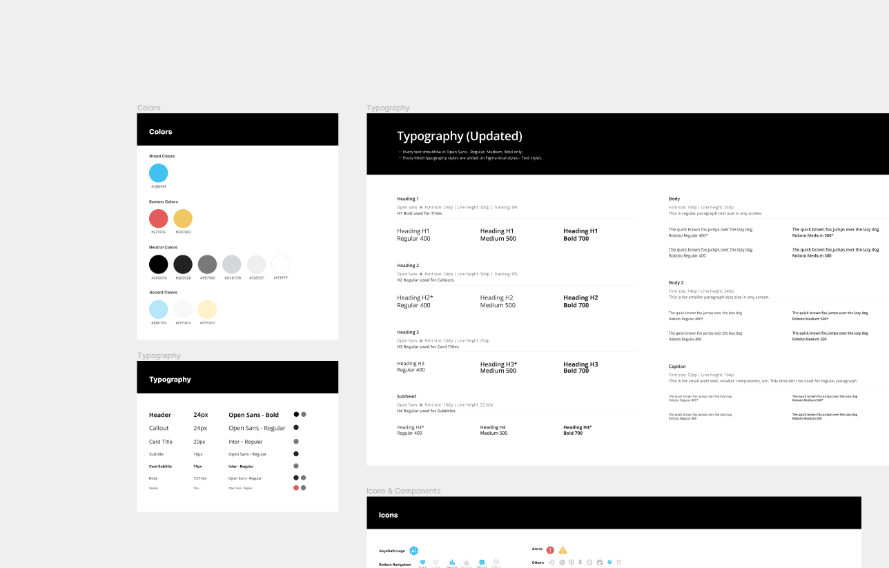
Employing the principles of atomic design, we managed to establish a system that introduced consistency and a unified visual appeal to the design.
Our prototype-ready components allowed us to create multiple prototypes for all of our flows quickly. Creating these local components helped us standardize interactions.
Breaking down information
Contextualizing the data.
Deeper analysis for caregivers
Creating self-explanatory means of representing data.
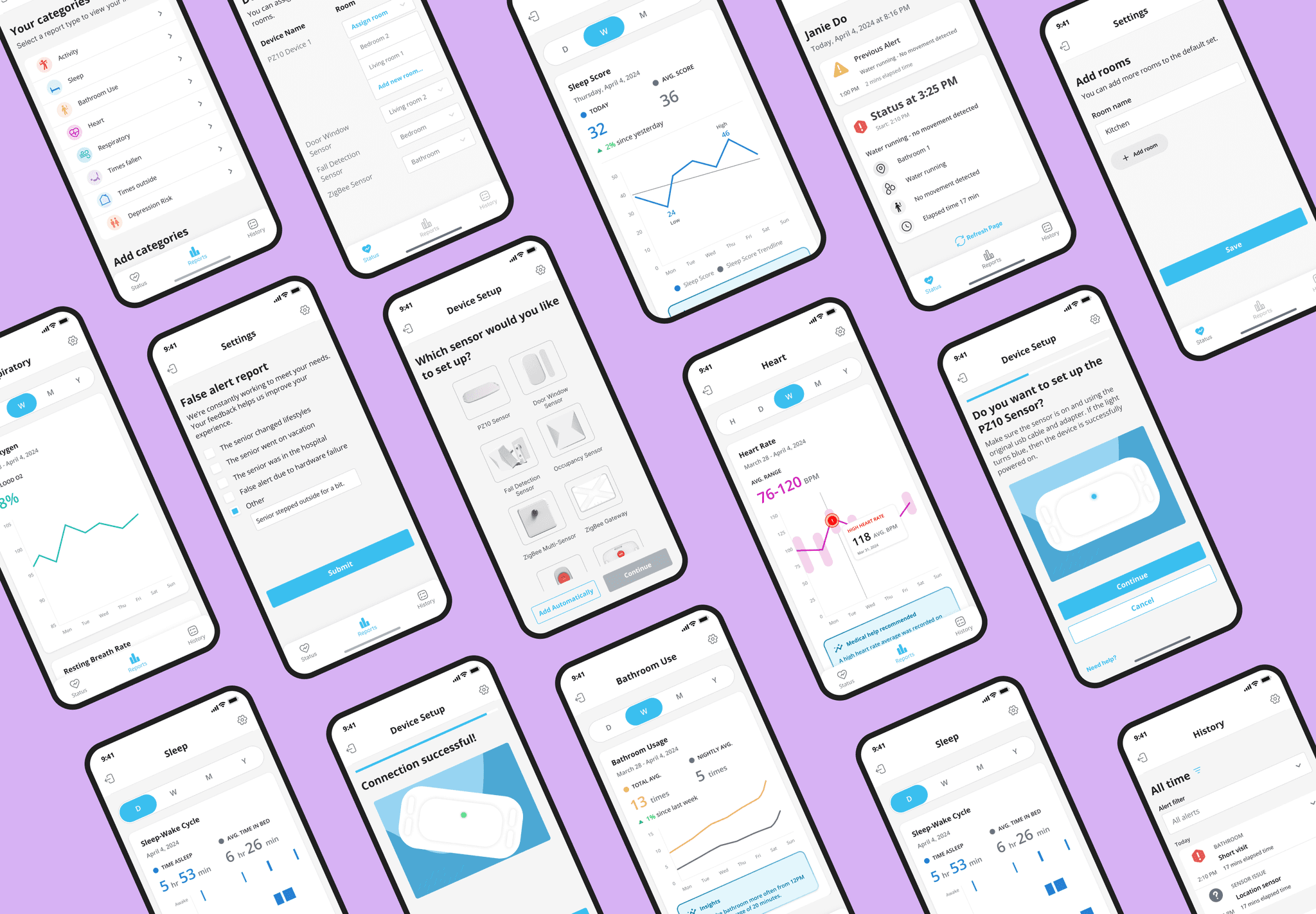
I proposed providing a distinct indicator for caregivers to identify abnormal health ranges. These kinds of visual cues help improves details for doctor visits or just at-home care.
📌 Learnings & Next steps
If I had more time on the project, I would conduct another round of user testing to test the redesigns and see if they were able to meet our goals.
I learned to design data for people. This meant keeping data and visuals consistent while keeping it contextual. This was important in order to build trust with users- we want users to trust us in order to deliver insights based on pattern recognition.
🔮 Things I'd love to add
The future for Aeyesafe looks bright! With the power of AI on our side, it's possible to drive countless changes and introduce more capabilities such as…
providing summarized weekly alerts
or mark improvements in senior conditions through notifications, or highlights
allowing traveling nurses or doctors to access senior info via Physician View to add their own notes or be able to review patient conditions
adding multiple senior profiles to the app
